Dispatch #086
The World Had to Survive the Camera
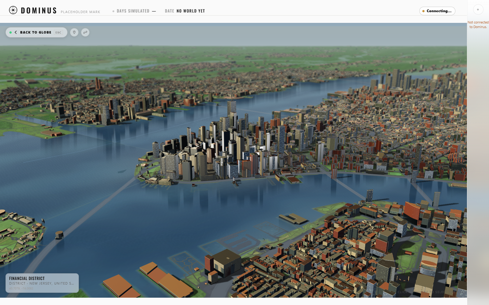
The idea behind Dominus is to represent a world as it evolves: the globe, every country, every city, every block.
We want to be able to look at the planet as a whole, choose a country, move into a city, and see the places where its people live and work. As the simulation progresses, the ambition is for those places to change with it. Buildings can be constructed, others can be demolished or destroyed, and neighborhoods can grow into something different from the place we started with.
Think of the scale of a grand strategy game, with an interest in the everyday lives and surroundings you might associate with The Sims. That is the direction we are working toward. The connection between the simulation and every visible city block is a long-term goal, and the graphics described here are part of the foundation for it.
To build that foundation, we first needed a starting world. We chose the real Earth: its countries, coastlines, terrain, streets, waterways, and buildings. The simulation could then have a recognizable place in which to develop its own history.
It was a straightforward idea to describe. At the beginning, we still had to work out how to build it.
Where would all that information come from? How would we fit sources made for different purposes together? How much detail could we show in a browser? And how could someone move from the globe to a neighborhood without waiting for us to load the entire planet?
Before the skylines, there was the data work. A computer worked around the clock for more than a month to process and prepare the worldwide building data. Downloading records was only part of it. We had to turn them into something the game could find, load, and draw, while checking that buildings had not been lost along the way.
That investment gave us the beginnings of a world we could explore. It also began a much longer series of decisions about how to show it: which details to preserve, which to generate, how to handle distance, and what to do when a technically successful render still looked wrong.
This is the story of building that visible world, from its underlying data layers to the missing neighborhoods, strange water, and changing buildings that taught us how to test it.
The screenshots in this dispatch are actual development and staging captures. Some were taken with the simulation connection disabled to isolate graphics, which is why their interface says “No world yet.” They document particular revisions, including their remaining imperfections.
First, we needed more than one Earth
From orbit, Earth looks like an image. From a city, it becomes a collection of surfaces, structures, boundaries, and gaps. A satellite picture cannot tell the renderer how tall a building is. A building footprint cannot tell it where a river flows. A country border cannot tell it where to put a tree.
We built the view from separate layers, each responsible for a different part of the scene.
Natural Earth supplies the geographic foundation for the game countries. Those boundaries connect the map to country identity, selection, and political overlays. Keeping that layer separate matters: a change to the street map should not change which country a player has selected.
NASA Blue Marble supplies the broad image of the planet. It gives the globe its recognizable continents and large-scale surface character. It is an orbital foundation, not street-level photography.
Copernicus elevation data gives the land its shape. Our initial global terrain build used GLO-90, a 90-metre elevation product, with additional detail tiers developed afterward. GEBCO provides a separate ocean-depth relief layer. We deliberately kept underwater relief separate from the land elevation used to raise the terrain.
OpenStreetMap-based cartography supplies the context between buildings. Early versions used bounded extracts and supplementary generated content. The worldwide context rollout moved to a self-hosted Protomaps archive for roads, paths, coastlines, water, parks, land use, and place labels. Its role is context; it is not a complete inventory of every mapped object or every OSM tag.
Overture supplies the dedicated worldwide building foundation. We pinned a release and processed footprints, building parts, height information, and source identities into our own archives. Where the data provides a height, that is different from a height we estimate. Where several small structures are represented together for distance rendering, that is different from an individual building.
Climate and vegetation data help the landscape vary geographically. The later vegetation system combines the Beck Köppen-Geiger climate classification with a monthly greenness cycle derived from NOAA/NASA VIIRS observations. That gives us a basis for regional and seasonal variation instead of painting the entire planet the same green.
The last layer is ours: the rendering and art direction that turn those records into roofs, walls, glass, foliage, shadows, water surfaces, and atmosphere.
That distinction is essential. A mapped footprint does not mean we know the real windows on the building. Much of the architectural appearance is generated. Dominus uses real geography as its foundation, but it is not a surveyed, photorealistic digital twin of every street.
The month that did not look like graphics work
The computer spent more than a month working around the clock on the worldwide building data. Much of that work happened before there was a convincing skyline to show for it.
The worldwide run covered 16,174 processing cells and assembled 1,281 final tile packages. Completion meant more than writing files. We had to account for the buildings and parts represented in them, keep grouped records distinguishable from individual structures, check for missing or conflicting identities, and preserve completed work through interruptions.
Some of the longest conversations were about checkpoints, disk space, validation, and whether a process was actually advancing. A large database file was not proof of useful progress. A completed geometry pass did not mean the identity checks or publication had finished.
There was a practical reason to be stubborn about this. When a rendering defect appeared later, we needed to know whether we had lost geographic data or simply drawn it incorrectly. Without that separation, every strange skyline threatened to send us back to the beginning.
We also chose to serve the map archives ourselves. PMTiles lets a browser request the relevant byte ranges from an archive rather than download the whole planet. Versioned files and manifests make it possible to know which data a client is using. The world's large data assets can be published separately from the application code.
It is less dramatic than a new lighting effect. It is what makes a new lighting effect safe to investigate.
A map renderer was only the beginning
The first building approach could raise polygons and repeat facade patterns over their sides. It was useful, but it had a visible ceiling: too many structures read as boxes wrapped in wallpaper. Trees had their own version of the problem, with simple shapes that stopped being convincing as the camera approached.
We explored richer custom rendering. One particularly instructive experiment reported that its lighting and shadows were active while the image still showed flat buildings. The shader bindings had failed. The diagnostics described the configuration we wanted, not the picture the player received.
The eventual detailed building path used Three.js alongside MapLibre. MapLibre remained responsible for the geographic view and map layers; the richer scene could handle architectural geometry, materials, lighting, and reflections.
Sharing a screen did not make them agree automatically. Cameras, coordinate systems, elevations, lighting, and the moment one representation replaced another all had to line up.
In one early test, detached dark roof slabs looked like bad geographic data. They were actually a sign error: roofs and walls used different coordinate conventions. The roofs were being placed on the opposite side of an axis from their own buildings.
It was an early warning against diagnosing every black shape as the same bug.
Manhattan was not supposed to be a lawn
Once the city became more detailed, another problem became harder to ignore. New York looked sparse beyond the foreground towers. There was too much green between buildings.
We could have reduced the grass saturation or added more haze. Instead, we compared the rendered sources with official New York City building footprints in four sample neighborhoods.
The audit found several problems working together.
At one zoom threshold, the renderer discarded groups of smaller buildings as though individual replacements were about to arrive. But the archive had already reached its highest available detail level. Moving closer reused those tiles. The replacements never came.
In the Astoria sample, the complete dedicated geometry overlapped about 92% of the official footprint area. After grouped records were excluded, the remaining individual and part geometry overlapped about 10%. Those are area measurements within one sample, not a claim that 90% of Astoria's buildings were absent from every rendering pass. They nevertheless explained why filtering could empty a neighborhood that existed in the data.
A distant rendering path was also shrinking building-shaped polygons using an inset intended for whole city blocks. And the paved block treatment expected a layer that the active basemap did not contain. The combination exposed the default lawn underneath.
The correction was to preserve the available building coverage through the detail transition, stop applying the wrong shrinkage, and restore appropriate urban ground coverage. Parks still needed to be parks. Dense attached city blocks needed to stop looking like houses scattered across a golf course.
We did not need to regenerate the month-long building archive to fix those renderer mistakes.
The haze argument was really about several things
The request was simple: distant buildings should fade and soften, the way a city does when there is air between you and it.
Our early attempts made the view look like a foggy day. The middle distance became too pale. We reduced it, changed the camera, compared again, and eventually made the effect respond more gently to a downward-looking view. A steep view into a nearby neighborhood should not receive the same treatment as a long view toward the horizon.
Then we found a contrast boundary that survived even when the atmosphere was disabled.
Those buildings were being drawn by a different rendering path. Their material choices and lighting response differed from the detailed foreground. Some experiments to bring them into agreement produced the memorable baby-blue-and-orange phase.
More haze would have concealed the evidence while leaving the cause intact.
We brought material selection closer together and expanded the detailed coverage where the loaded source supported it. A fallback can be simpler, but an arbitrary boundary between two renderers should not become a different neighborhood palette.
This also changed how we reviewed images. Comparisons needed the same camera and the original baseline. Comparing the latest attempt only with the previous attempt made it too easy to forget what had improved and what had been lost.
Water taught us to inspect the layers underneath
Water was especially good at exposing disagreements elsewhere in the scene.
Reflections disappeared in places where water was still visible. A brighter patch in the harbor turned out to have overlapping river and ocean coverage, receiving translucent effects twice. A change that reduced obvious repetition could make the surface look too smooth. A convincing running-water pattern was wrong for a still pond.
We kept separate water types rather than deciding that one attractive shader should cover everything. We also had to make overlapping water polygons agree about which surface owned a patch of the map.
Singapore exposed a different failure. Dark blue shapes appeared in the reservoir, with thin lines crossing the water.
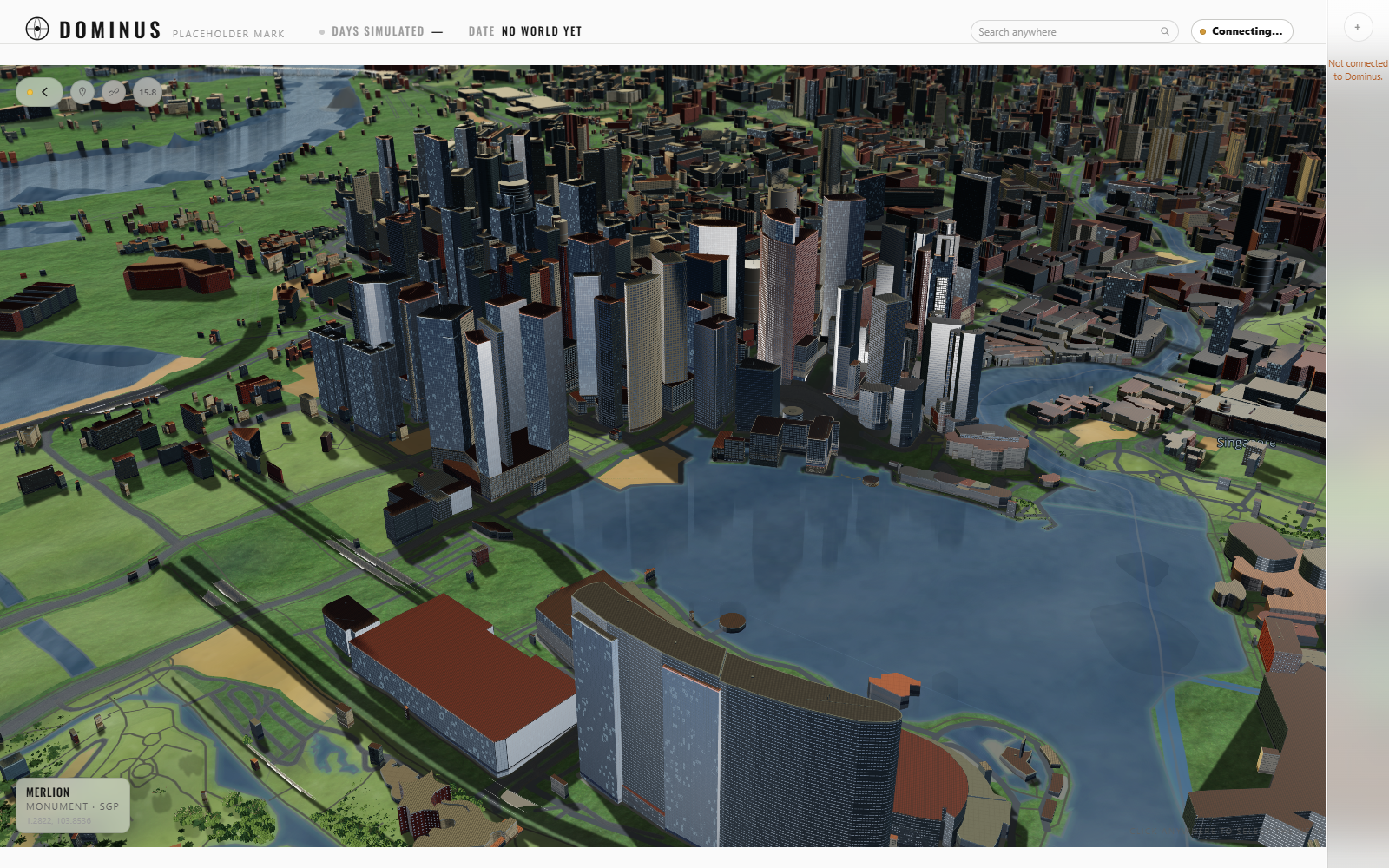
Before: the dark reservoir patches were areas where the terrain and reflection surface disagreed. The thin crossing line came from a separate cartographic layer.
The dark patches were not painted into the water texture. The base water followed the terrain mesh, while the reflection surface sampled a simpler set of points. Terrain between those points could intersect the reflection surface and cut holes in the effect. The line had another cause: a river centerline was being drawn as though it were a quay or shoreline.
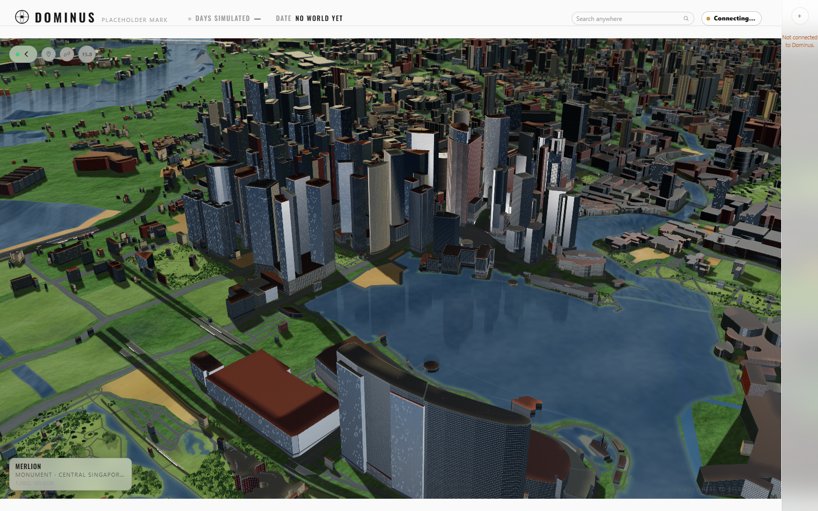
After: the foreground reservoir patches and crossing line are removed at the same camera. Raised terrain shapes in the distant channels were a separate unresolved problem in this capture.
We improved the reflection surface's agreement with terrain and restricted the shoreline treatment to the correct geometry. Turning off depth testing would have been an easy way to hide one symptom, but it would also have allowed reflections to draw over things that should cover them.
The remaining cone-shaped terrain was another reminder to separate diagnoses. Correcting the reflection mesh did not correct bad elevation samples in the source terrain. Long dark bands over land could come from generated bridge shadows. Similar-looking artifacts did not necessarily share a cause.
A forest has to remain the same forest
Central Park made the tree transition impossible to overlook. Detailed foreground trees had fine foliage, trunks, and varied color. A short distance behind them, brighter solid canopies looked like a different species of object.
Using simpler trees at a distance was reasonable. Letting the simplification become obvious so close to the camera was not.
We worked on the distance transition and the relationship between the detailed and simplified foliage. The larger lesson was that a level of detail includes more than polygon count. Color, silhouette, density, and the amount of light passing through the canopy all affect whether the eye accepts the replacement.
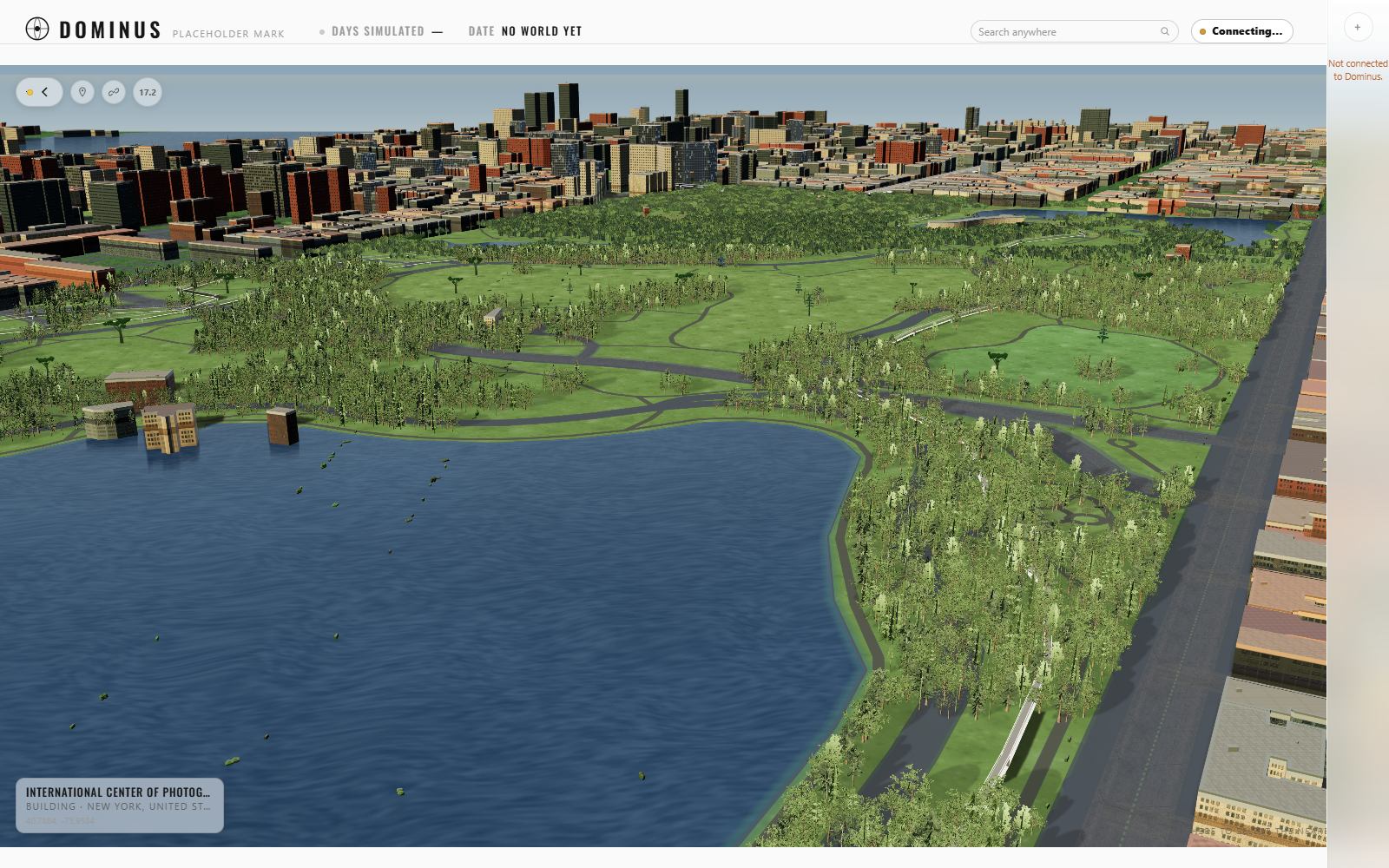
Central Park became a useful stress test: open lawn, dense trees, reflective water, and a city skyline in one view. This is a development capture, not a claim that every element was finished.
Climate introduced another decision. Dominus time can move much faster than real time. We did not want the landscape to race through seasons while someone was looking around. The vegetation view captures the simulation date on entry, while short visual effects such as water can animate in ordinary real time. Leaving and returning can pick up the newer season.
A world can keep progressing without making every moment of looking at it feel unstable.
The camera had to come first
Keeping completed geometry visible during movement helped with pop-in, but it exposed work that the old rendering path had hidden. The camera became less responsive.
The requirement became explicit: rendering must not prevent the user from changing the camera.
We removed repeated work from camera frames, split long vegetation tasks into smaller pieces, moved countryside planning into a worker, and made obsolete jobs cancellable. Completed geometry could remain visible while its replacement was prepared. Late results from an old camera position could not simply arrive and take over the new view.
That improved responsiveness without reducing the chosen texture resolution or scene density in that change. It did not make rendering free, and it did not establish a universal frame-rate guarantee. It established a better priority: a player's gesture should not have to wait behind scenery refinement.
But continuity requires more than holding the previous frame. Vancouver showed us how a completed new frame could still be wrong.
The tower that became a house
The report arrived as two screenshots of Vancouver. In one, the waterfront was lined with towers. Move the camera a little, and those same buildings became low blocks. Both views had finished rendering. Nothing in the simulated world had happened between them.
The archive still contained the heights we had spent so long preparing. We were changing the city simply by looking at it.
The Vancouver investigation matched buildings by stable identity across two nearby camera positions. Among 3,009 shared identities, 719 resolved heights changed. One recorded 125-metre building became roughly 6.6 metres tall.
The renderer had a rural classification rule based partly on the buildings and place labels currently loaded around the view. Moving the camera changed that local evidence. The rule could then classify an urban building as rural and overwrite its stored dimensions with house or barn dimensions.
Both frames could report completion because the renderer had successfully drawn what its own faulty rule requested.
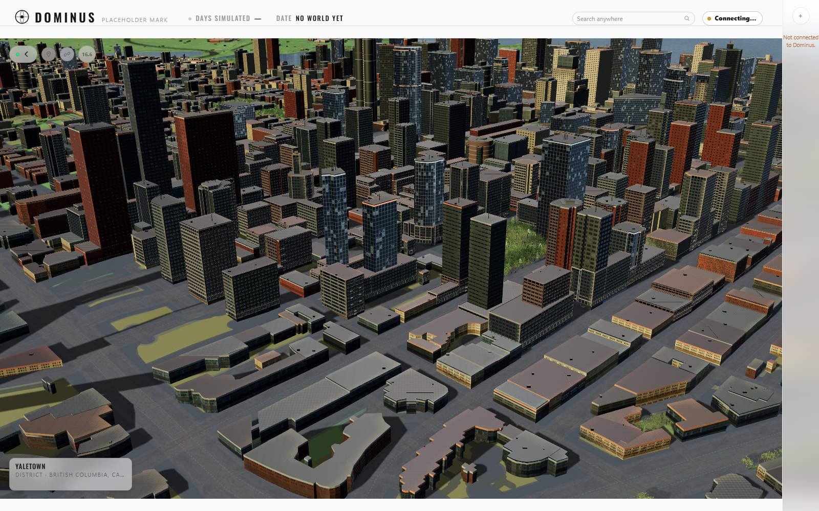
Before: the original failing camera position, after rendering had completed.
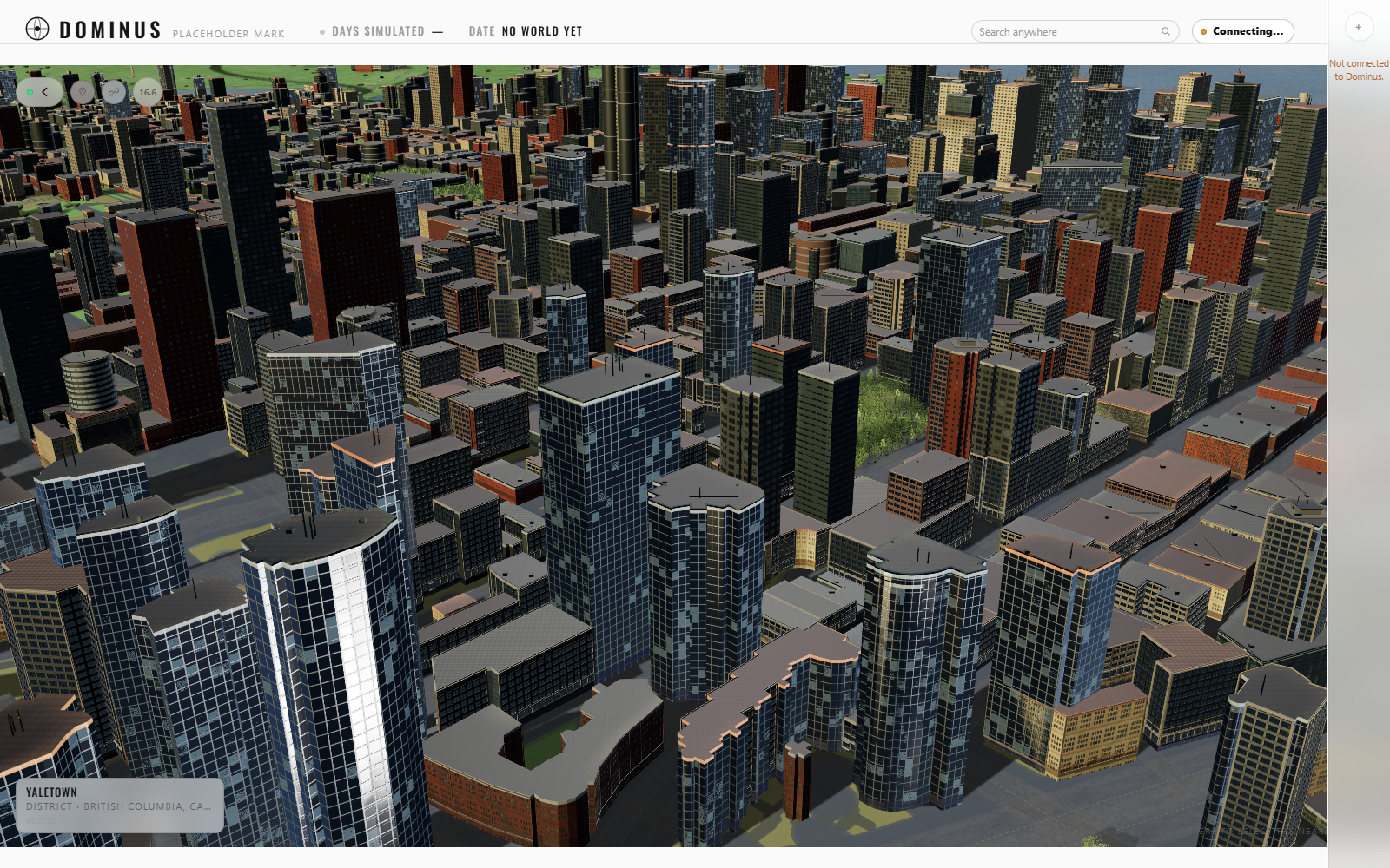
After: the same camera on the corrected staging build. The test found zero height or base-height changes among the same 3,009 shared identities.
We made source dimensions authoritative, limited rural fallback dimensions to appropriate cases with missing source data, and corrected the cache rules so actual geometry changes could not be missed.
Then we tested the journey: move out, move back, load the destination fresh, compare identities, and inspect the rendered result. A screenshot from one comfortable angle was no longer enough.
What we mean by a believable world
The graphics work has not made every facade exact, every bridge finished, or every terrain sample trustworthy. The map is still a work in progress. Real source data has gaps and generalization; generated architecture has limits; different machines still make different demands on the renderer.
What changed was the standard we use to judge it.
Archive validation tells us whether the data survived. Browser checks tell us whether the intended rendering path is running. Screenshots tell us whether the result looks right. Movement tests tell us whether it stays right when someone uses it. We needed all four, and more than once we mistook success in one for success in the others.
The reason to keep doing this is the city itself. Eventually, its buildings, roads, workplaces, institutions, and waterfronts need to provide a credible setting for the lives and events inside Dominus. That is difficult to believe when a tower becomes a house because the player moved the mouse.
Before the city can tell its stories, it has to stay put.
Built from the Dominus Graphics, World Geo, World Geo 2, and Design discussions, the Matrix visual-foundation review, and the associated implementation and browser evidence. The account covers development through September 2026; illustrated fixes were tested in local or staging builds.
Data and technology acknowledgements: Natural Earth, NASA Earth Observatory, Blue Marble: Next Generation, Copernicus DEM, GEBCO, OpenStreetMap contributors, Protomaps, Overture Maps, Beck et al. Köppen-Geiger classification, and NOAA/NASA VIIRS NDVI Climate Data Record. Map presentation uses MapLibre GL JS with Three.js for the detailed scene. Source versions, processing records, and attribution notices are retained with the project's data artifacts.